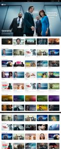
Thoughts on Apple TV+ web design –
When I log into Apple TV+, the big banner is always about the current hit, like <Severance> season 2, rather than the one I unfinished watching. I know this is about campaign and promotion, but this introduces unnecessary friction.
I have to click on “stream now“, and scroll down to pick the one I have been watching.

Why? Why that additional friction? Is this by design? A good design should be unnoticed, but natural.
I am not a designer, but this sure is a bad user experience for me.